Mehr als nur hübsche Bilder
Wenn wir die 4K Infografik-Funktion vorstellen, denken viele zuerst: "Schöne Illustration für Social Media!" Und ja, das kann sie auch. Aber der eigentliche Wert liegt tiefer.
Eine Infografik, die ein Buch zusammenfasst, ist ein Spiegel des Verständnisses. Sie zeigt nicht nur, was im Buch steht – sie zeigt, wie die Zusammenhänge verstanden wurden.
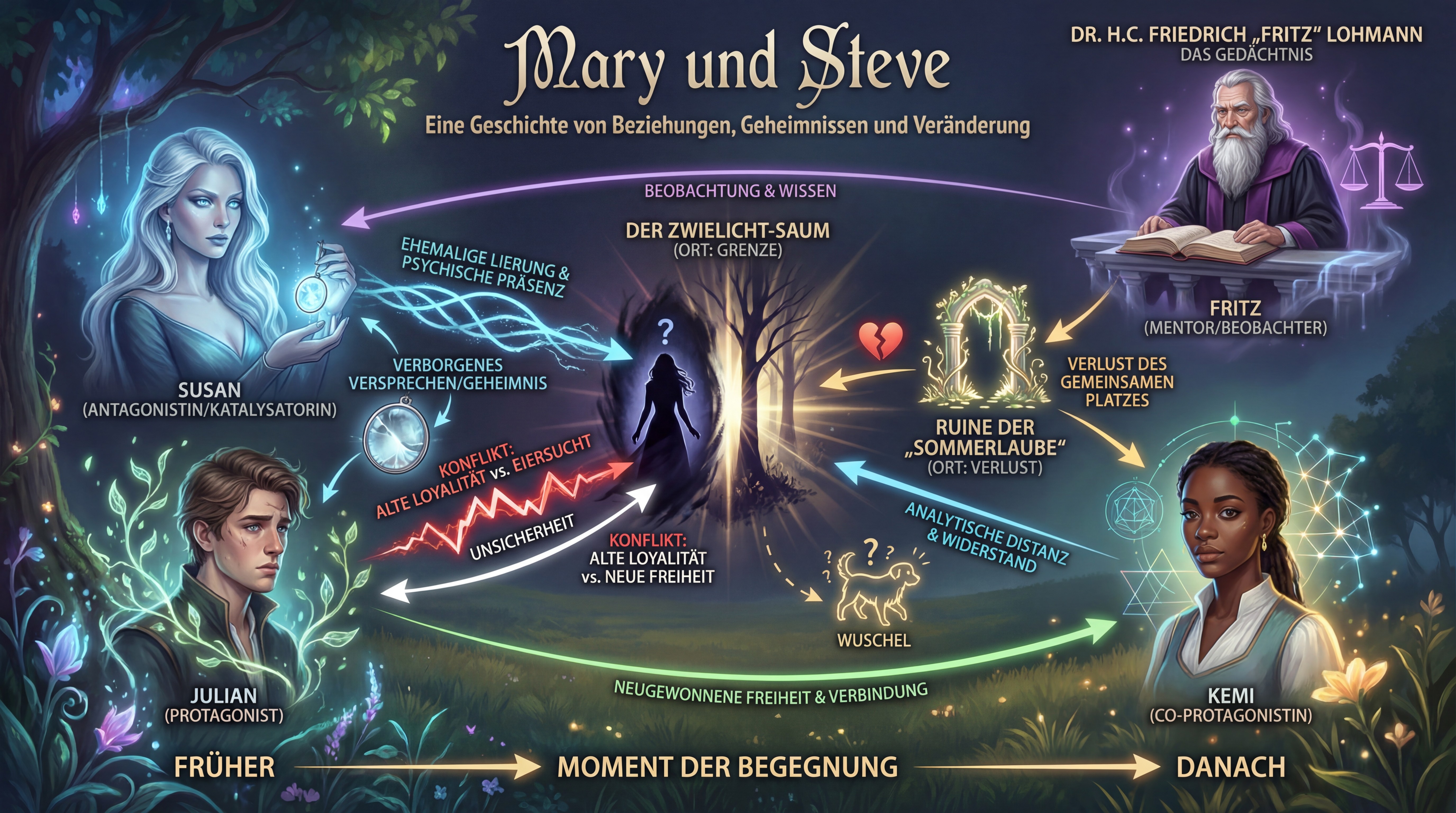
Eine Infografik zu "Mary und Steve" – auf einen Blick sichtbar: die emotionale Reise, die Beziehungsdynamik, die Wendepunkte.
Der Verifikations-Aspekt: Wie "denkt" die KI?
Wenn du mit KI-Unterstützung schreibst, arbeitet im Hintergrund ein System, das deinen Text versteht – oder zu verstehen versucht. Aber wie gut versteht es wirklich?
Die Infografik ist ein Verifikations-Werkzeug:
Was du überprüfen kannst:
- Sind die Hauptthemen richtig erkannt?
- Erscheinen die zentralen Konzepte prominent?
- Fehlt etwas Wichtiges?
- Stimmen die Beziehungen?
- Bei Romanen: Sind die Charakterbeziehungen korrekt dargestellt?
- Bei Sachbüchern: Sind die kausalen Zusammenhänge richtig?
- Ist die Gewichtung angemessen?
- Bekommt der Hauptplot/das Kernthema den meisten Raum?
- Oder dominiert ein Nebenaspekt fälschlicherweise?
- Stimmt die zeitliche/logische Abfolge?
- Bei Romanen: Spiegelt die Grafik den Handlungsbogen wider?
- Bei Sachbüchern: Ist die Argumentationskette nachvollziehbar?
Wenn die Infografik "falsch" aussieht, ist das wertvolles Feedback. Vielleicht hat die KI etwas missverstanden. Oder – und das ist oft der Fall – das Buch selbst ist an dieser Stelle unklar.
Für Romane: Die emotionale Landkarte
Bei Belletristik zeigt die Infografik die emotionale und narrative Struktur:
- Charakterkonstellationen: Wer steht im Zentrum? Welche Beziehungen sind zentral?
- Konfliktlinien: Welche Spannungen treiben die Geschichte?
- Wendepunkte: Wo ändert sich alles?
- Thematische Motive: Welche Symbole und Themen durchziehen die Geschichte?
Das ist nicht nur hübsch – es ist ein Werkzeug für Autoren:
Sieht deine Protagonistin in der Grafik wie eine Nebenfigur aus? Dann kommt sie vielleicht im Text zu kurz.
>
Fehlt der zentrale Konflikt? Vielleicht ist er zu subtil angelegt.
>
Dominiert ein Nebenplot die Visualisierung? Zeit, die Balance zu überdenken.
Für Sachbücher: Die Wissenslandkarte
Bei Sachbüchern wird die Infografik zu einem Lern- und Übersichtswerkzeug:
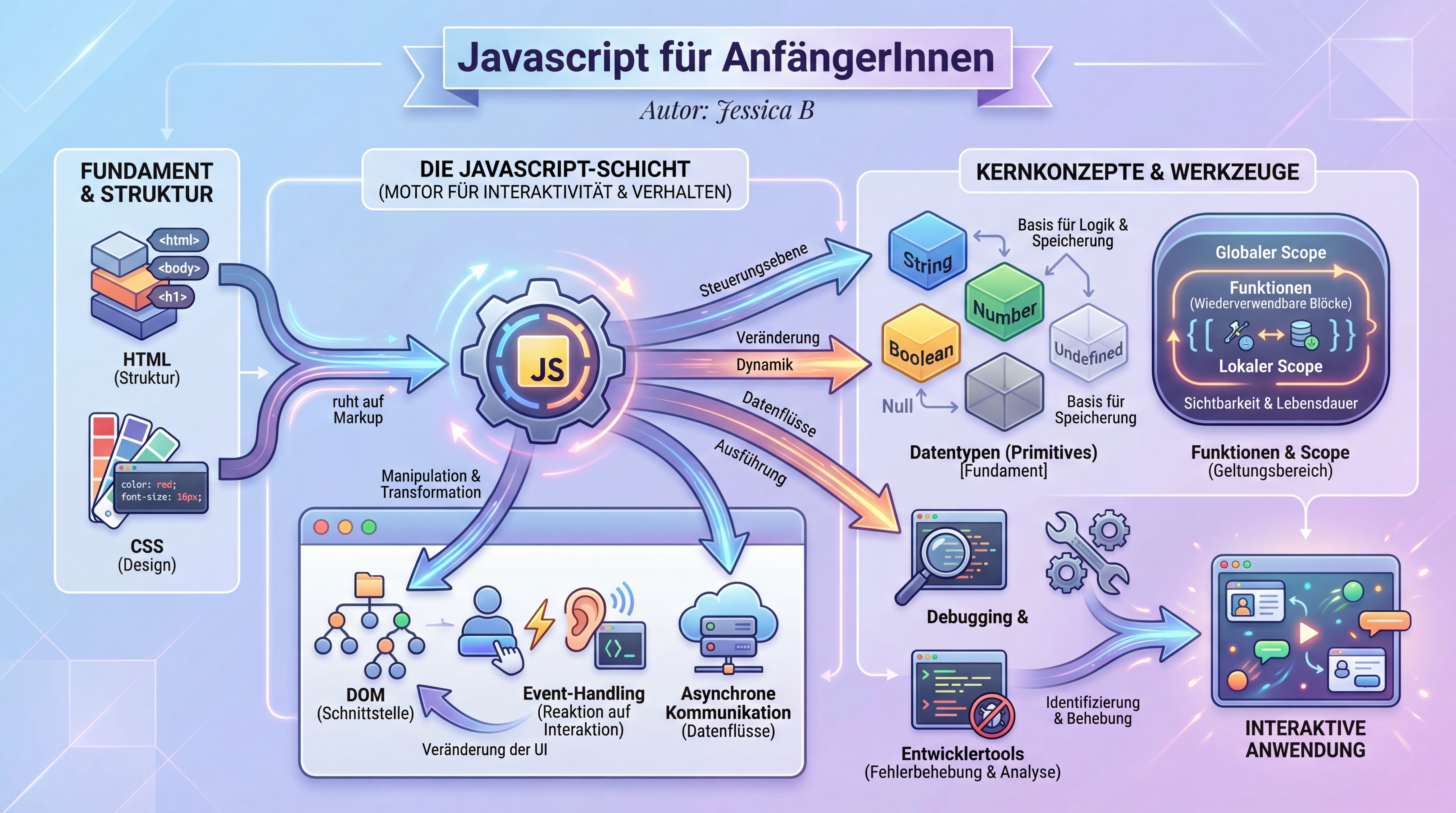
Eine Infografik zu "JavaScript für AnfängerInnen" – die Struktur des Lernstoffs auf einen Blick: Konzepte, Zusammenhänge, Lernpfade.
Für Autoren:
- Vollständigkeit prüfen: Sind alle wichtigen Konzepte abgedeckt?
- Zusammenhänge klären: Sind die Verbindungen zwischen Themen deutlich?
- Komplexität managen: Ist die Struktur für Leser nachvollziehbar?
Für Leser:
- Überblick gewinnen: Vor dem Lesen – was erwartet mich?
- Lernen strukturieren: Wie hängt alles zusammen?
- Wiederholen: Nach dem Lesen – habe ich alles verstanden?
Die Infografik wird zum Advance Organizer – ein Begriff aus der Lernpsychologie für Materialien, die vor dem eigentlichen Lernen einen Überblick geben und das Verständnis verbessern.
4K Auflösung: Warum die Details zählen
Wir generieren Infografiken in 4K Auflösung (3840×2160 Pixel). Das ist kein Marketing-Gimmick:
- Zoom-fähig: Komplexe Bücher haben komplexe Strukturen. Bei 4K kannst du reinzoomen, ohne dass es pixelig wird.
- Druckbar: Autoren nutzen die Grafiken für Buchcover, Poster, Präsentationen. 4K reicht für professionellen Druck.
- Detail-reich: Mehr Pixel bedeuten mehr Platz für Nuancen – wichtig bei Büchern mit vielen Elementen.
- Zukunftssicher: Monitore werden größer. 4K bleibt auch morgen noch scharf.
Die technische Seite: Wie entsteht die Infografik?
Der Prozess kombiniert mehrere KI-Modelle:
- Text-Analyse: Das Sprachmodell liest dein Buch und extrahiert:
- Zentrale Entitäten (Charaktere, Konzepte, Orte)
- Beziehungen und Abhängigkeiten
- Narrative/argumentative Struktur
- Emotionale Tonalität
- Strukturierung: Die Extraktion wird in ein visuelles Konzept übersetzt:
- Hierarchie der Elemente
- Positionierung (zentral vs. peripher)
- Verbindungslinien
- Farbcodes für Kategorien
- Bildgenerierung: Ein Bild-Modell setzt das Konzept in eine ästhetische Grafik um:
- Einheitlicher Stil passend zum Buchgenre
- Lesbare Beschriftungen
- Visuelle Harmonie
- 4K Upscaling: Die finale Grafik wird auf 4K hochskaliert, wobei Details erhalten und verbessert werden.
Anwendungsfälle in der Praxis
Romanautoren nutzen die Infografik für:
- Plotting: Vor dem Schreiben – visualisieren der geplanten Struktur
- Revision: Nach dem ersten Entwurf – Schwachstellen identifizieren
- Marketing: Für Social Media, Buchpräsentationen, Pressemappen
- Leserbindung: Als Bonus-Material für Newsletter-Abonnenten
Sachbuchautoren nutzen sie für:
- Buchplanung: Die Struktur visualisieren, bevor das erste Kapitel steht
- Qualitätskontrolle: Prüfen, ob die Argumentation schlüssig ist
- Lehrmaterial: Als Handout, Folien-Vorlage, Poster im Klassenzimmer
- Marketing: "Das lernst du in diesem Buch" auf einen Blick
Verlage und Lektoren nutzen sie für:
- Manuskriptbewertung: Schneller Überblick über Struktur und Vollständigkeit
- Covergestaltung: Als Inspiration oder direkte Vorlage
- Vertriebsmaterial: Für Kataloge und Vorschauen
Ein Beispiel: Was die Infografik verrät
Nehmen wir die Beispielgrafik oben (Mary und Steve). Was können wir ablesen?
- Zentrale Figuren: Mary und Steve stehen im Mittelpunkt – korrekt für eine Liebesgeschichte
- Emotionale Reise: Die Grafik zeigt einen Bogen von Begegnung über Konflikte zu Auflösung
- Unterstützende Elemente: Nebenfiguren und Settings sind sichtbar, aber nicht dominant
- Tonalität: Die Farbwahl und der Stil passen zum Genre (warm, romantisch)
Wenn diese Elemente nicht stimmen würden – wenn etwa Steve dominant erschiene, obwohl Mary die Protagonistin ist – wäre das ein Signal: Entweder versteht die KI etwas falsch, oder das Manuskript braucht Anpassungen.
Die Infografik als Dialog mit der KI
Letztlich ist die 4K Infografik ein Kommunikationskanal. Die KI zeigt dir: "So habe ich dein Buch verstanden."
Und du kannst antworten:
- "Ja, genau!" – Dann ist das Verständnis korrekt.
- "Nein, das stimmt nicht." – Dann weißt du, wo nachgebessert werden muss.
Dieser Dialog ist wertvoll. Er macht die "Black Box" KI transparenter. Du siehst nicht nur das Ergebnis (generierter Text), sondern auch das Verständnis dahinter.
Fazit: Mehr als Dekoration
Die 4K Infografik-Funktion in Hermes 3000 ist:
- Ein Verifikationswerkzeug: Überprüfe, wie die KI dein Buch versteht
- Ein Planungswerkzeug: Visualisiere Struktur vor und während des Schreibens
- Ein Lernwerkzeug: Für Sachbuchleser als Übersicht und Wiederholung
- Ein Marketingwerkzeug: Professionelle Grafiken in druckfähiger Qualität
Die hübsche Optik ist ein Bonus. Der eigentliche Wert liegt in der Transparenz – dem Fenster in das "Denken" der KI und der Struktur deines eigenen Werks.
Probier es aus: Generiere eine Infografik für dein aktuelles Projekt. Was siehst du – und was überrascht dich?